Which wall colors complement preserved moss wall art best?
Choosing a wall color for preserved moss wall art
When you hang preserved moss wall art, the wall behind it becomes part of the display. The right wall color can make the moss look richer and more dimensional, while the wrong one can flatten it or clash with its natural tones. The direct answer is that neutral, earthy, and muted natural shades work best. Think soft greys, warm beiges, olive tones, deep charcoals, and off-whites. These colors let the moss take center stage without competing for attention.
Preserved moss keeps its green hues because it is treated with a glycerin-based solution that replaces the natural moisture. The result is a stable, soft texture that ranges from deep forest green to lighter sage tones depending on the species. That range matters when you pick a wall color. A wall that is too bright or too saturated can make the moss look dull or washed out. A wall that is too dark can swallow the detail in the moss, making it read as a dark patch rather than a textured surface.
Neutral and warm greys
Grey is a popular choice because it sits between warm and cool. A light to mid-grey with a slight warm undertone picks up the subtle yellow-green in preserved moss without turning yellowish itself. It creates a calm backdrop that lets the moss’s texture stand out. Cool greys, especially those with a blue tint, can make the moss look more yellow than it is, so test a sample first. Paint a small card and hold it next to the moss piece in the room’s natural light before committing.
Earthy beiges and taupes
Beige is often seen as safe, but it works well here because it echoes the natural substrates that moss grows on in the wild: soil, bark, and stone. A warm taupe or a sandy beige creates a grounded look that makes the moss feel like a natural extension of the wall. The key is to avoid beiges that lean too pink or too peach, as those can make the green look muddy. Stick to beiges with a brown or grey undertone for a clean pairing.
Olive and sage greens
A wall painted in a muted olive or sage green can create a monochromatic look that feels cohesive and calm. The moss becomes a deeper, richer version of the wall color, adding depth without contrast. This approach works best when the moss piece has multiple shades of green within it, because the wall color will unify them. Be careful with the saturation: a wall that is too vivid will compete with the moss rather than support it. A low-saturation olive, almost a grey-green, is a safer bet.
Deep charcoal and dark navy
Dark walls are dramatic and can make preserved moss glow, especially when the moss is backlit by natural light or a picture light. A deep charcoal or a dark navy creates a high-contrast backdrop that makes the green pop. This works particularly well in rooms with good natural light, because the light bounces off the moss and separates it from the dark wall. In a dim room, a dark wall can make the whole display feel heavy, so consider the lighting before going dark. A picture light aimed at the moss can solve that problem and add a gallery feel.
Off-whites and warm whites
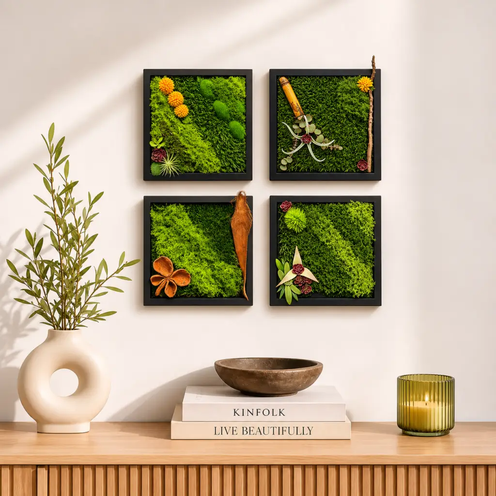
White walls are the default in many homes, and they can work well if you choose the right white. A pure brilliant white can make moss look slightly yellow in contrast, so a warm off-white with a hint of cream or oatmeal is better. It softens the transition between the wall and the moss, creating a gentle backdrop that does not distract. This is a good option when the moss piece is part of a larger gallery wall, because the white keeps the focus on the arrangement of pieces rather than any single color.
Colors to approach with caution
Some wall colors are tricky with preserved moss. Bright yellows and oranges can make the green look less vibrant by creating a complementary color clash that feels busy. Reds and pinks, unless they are very muted, tend to dominate the visual field and reduce the moss to a minor accent. Pastels like baby blue or lavender can feel out of place unless the room has a deliberate whimsical or nursery style. If you love one of these colors, consider using it on a single accent wall and placing the moss on a different wall, or frame the moss in a way that isolates it from the wall color.
How the frame influences the wall color choice
The frame of the moss piece matters too. A wood framed moss decoration with a natural oak or walnut finish changes how the wall color reads. A dark walnut frame on a light grey wall creates a strong contrast that frames the moss neatly. A light oak frame on a beige wall creates a softer, more continuous look. If you are choosing a wall color after buying the moss piece, bring the frame with you when you test paint samples. Hold it against the sample card and look at it from a few feet away, the distance from which the wall will normally be seen.
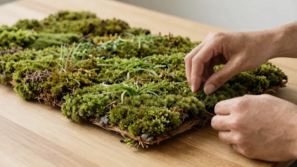
For a wood framed moss decoration, the wood tone can either anchor the piece or blend into the background. A dark frame against a dark wall can disappear, which may be the effect you want if the goal is a seamless floating look. A light frame against a dark wall makes the frame a visible border, which can work well in a gallery wall where each piece needs its own boundary. Think about the role you want the frame to play before settling on a wall color.
Lighting and room scale
Natural light changes how wall colors appear throughout the day. A grey that looks perfect at noon can look flat and cold in the evening under warm artificial light. Test your wall color sample under both conditions. The same is true for the moss itself: preserved moss can look slightly different in different light because its texture catches light unevenly. If the room has a picture light or track lighting aimed at the wall, that will be the dominant light source for the moss, so test the color under that light.
Room scale also plays a part. In a small room, a dark wall color can make the space feel cramped, and the moss can look heavier than it is. In a large room, a light wall color can make the moss feel too small and isolated. A good rule is to match the wall color’s intensity to the size of the wall and the size of the moss piece. A large moss installation on a large wall can handle a stronger color. A small piece on a large wall calls for a quieter background so the moss does not get lost.
Practical testing before painting
Paint samples are cheap and save a lot of regret. Paint a two-foot square on the wall where the moss will hang, then hold the moss piece against it for a few days. Look at it in the morning, at midday, and in the evening. Move it around if you are planning a gallery wall, because the color can look different depending on how close the pieces are to each other. This is especially important if the moss piece will sit near other wall art, because the wall color needs to work with all of them, not just the moss.

If you are renting and cannot paint, consider a large fabric backdrop or a removable wallpaper panel behind the moss. That gives you the color control without permanent changes. A large piece of foam board painted in your chosen color and mounted behind the moss works as a temporary test that doubles as a display solution.
Final practical advice
The best wall color for preserved moss wall art is the one that makes the moss look like itself: green, textured, and calm. Neutral greys, warm beiges, muted olives, deep charcoals, and soft off-whites all achieve that without effort. The room’s natural light, the frame’s wood tone, and the scale of the wall all influence the final look, so test before you paint. A well-chosen wall color turns a moss wall decor piece into a focal point that feels intentional and natural, not an afterthought.